Prismic
Rebranding a headless website builder aiming higher.
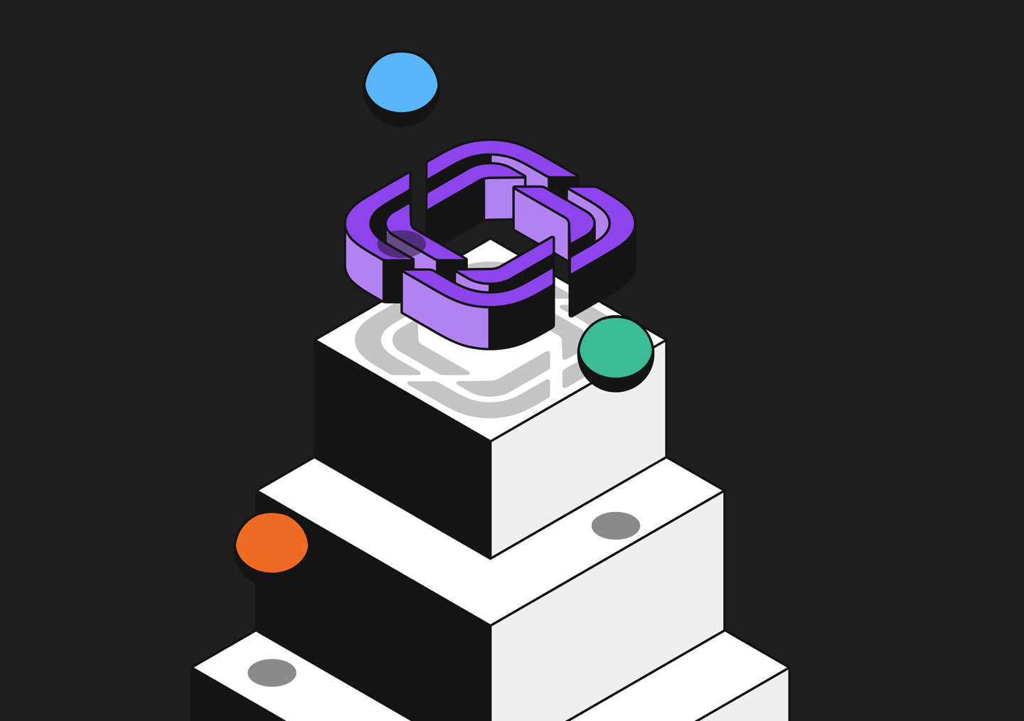
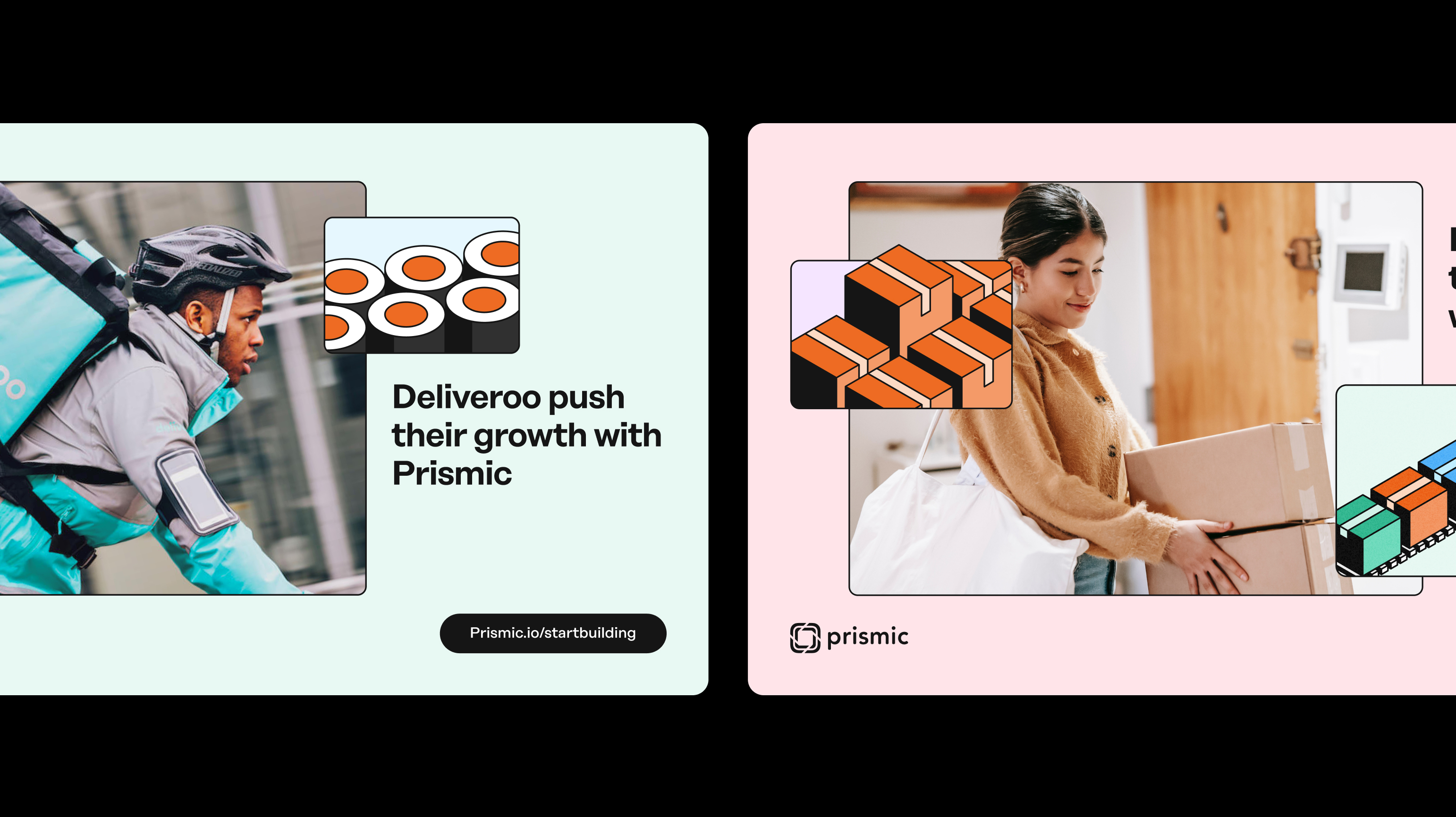
Prismic set its sights higher: the headless website builder now speaks to companies as they grow, with the same promise as before, total freedom and no compromise. Hervé led the complete rebranding of the site to carry that shift.
The Headless Website Builder that supports your growth.
When Prismic thought it was time to aim higher, Hervé team helped them to create a new brand that fit their goals and ambitions.
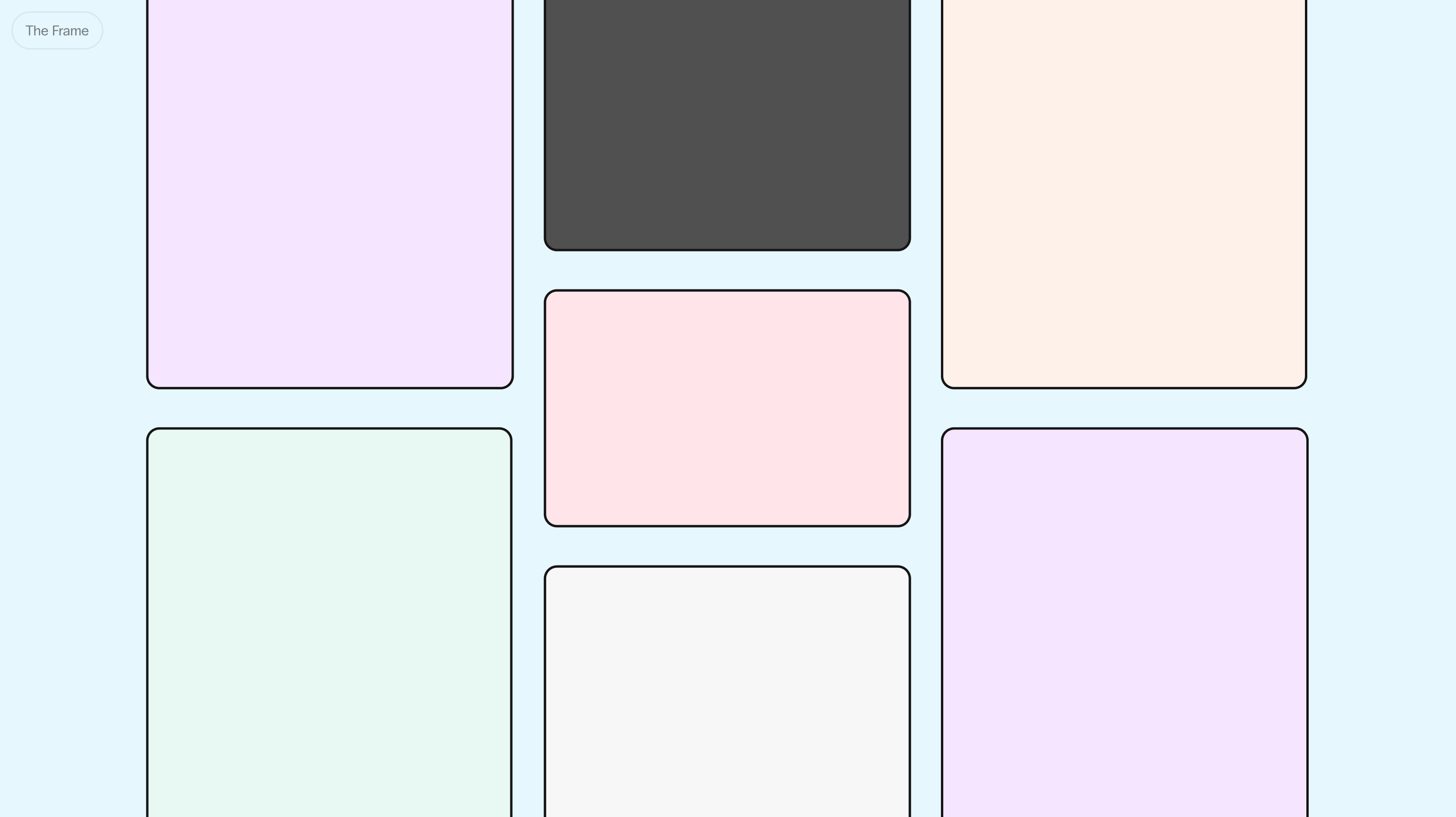
The four fondamentals
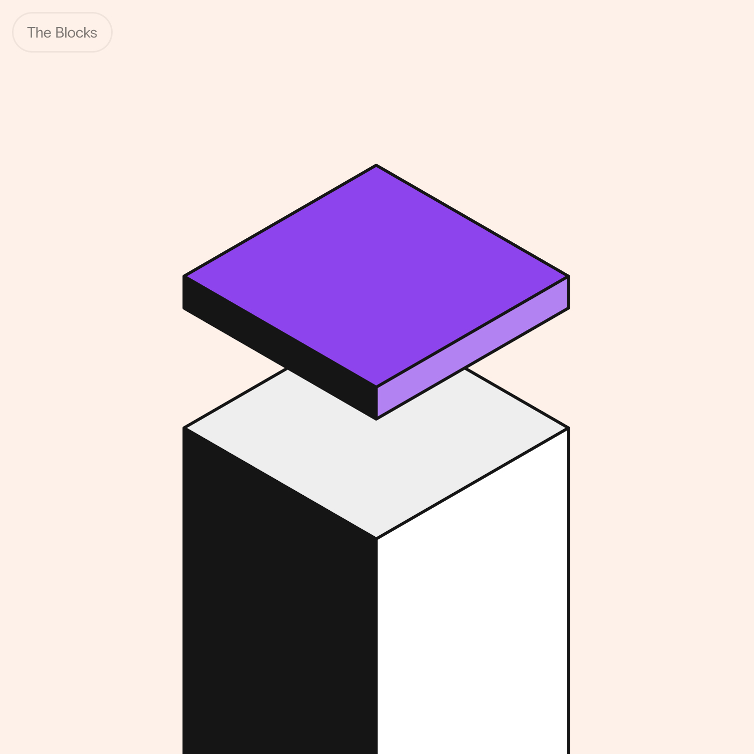
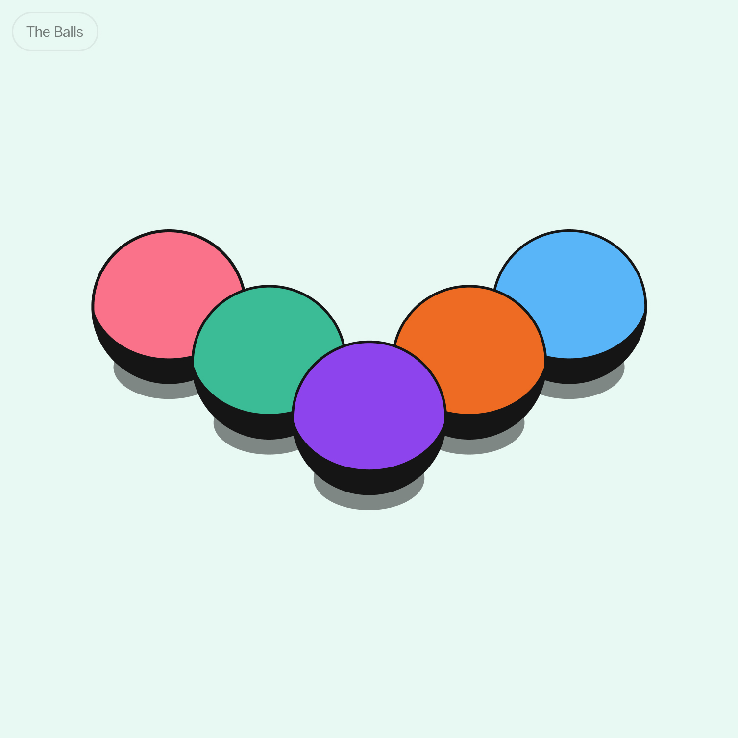
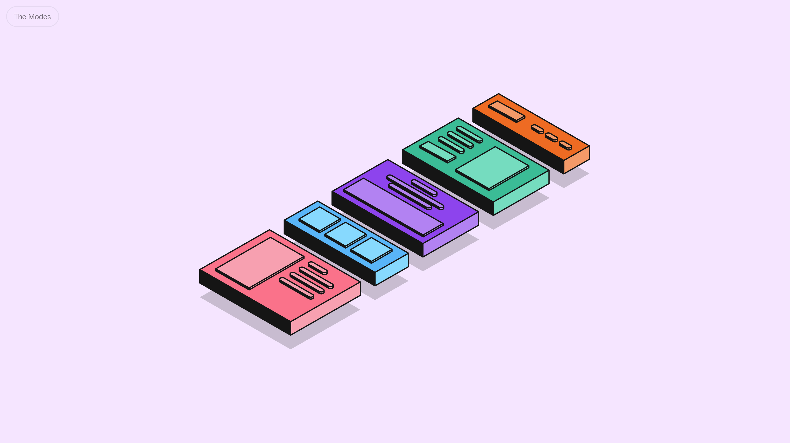
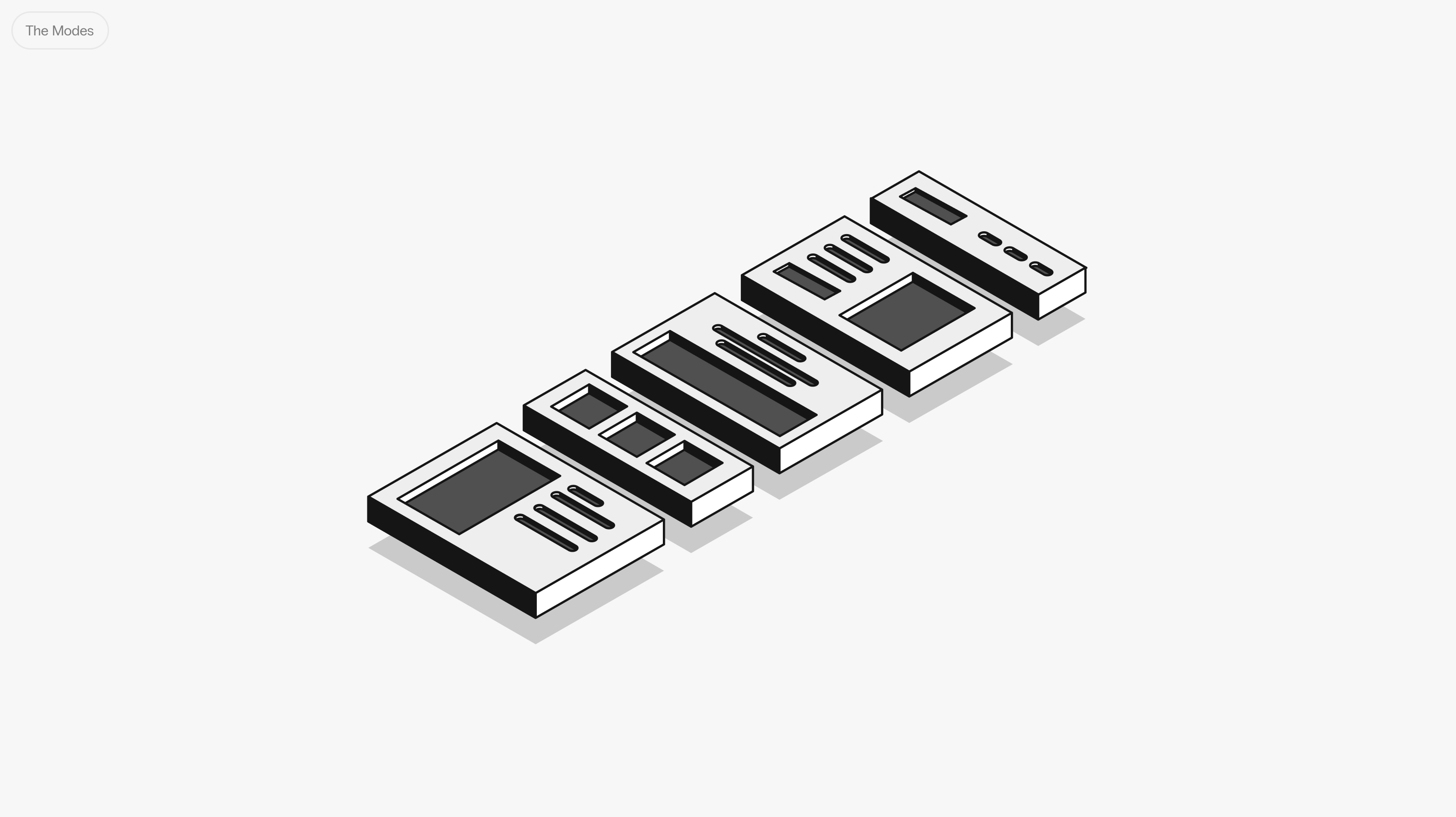
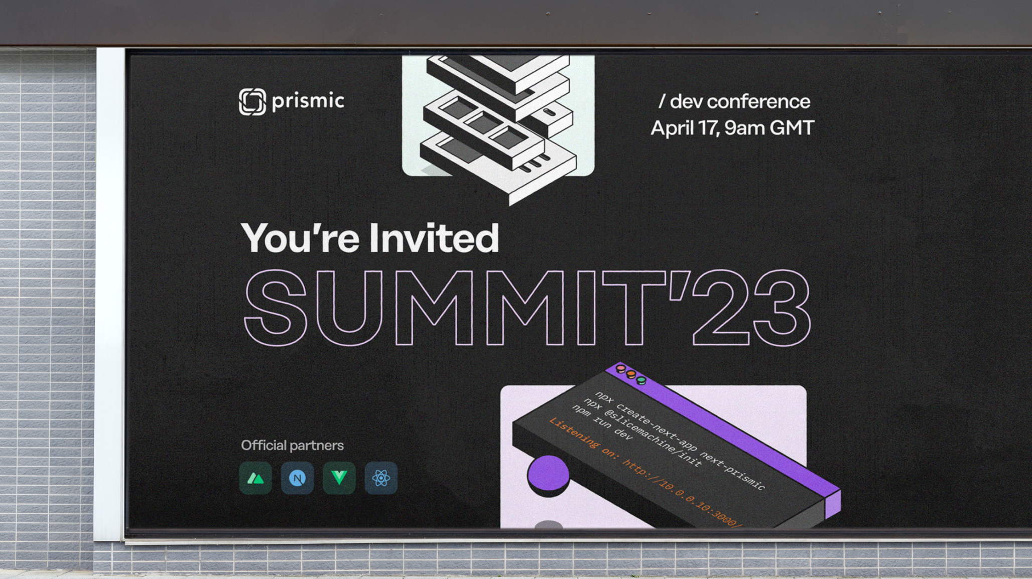
Beyond its colorful, high-contrast isometric style, Prismic’s new branding is built around four fundamental graphic elements:
- The Frame, a support for the life and growth of creations
- The Blocks, elements to combine
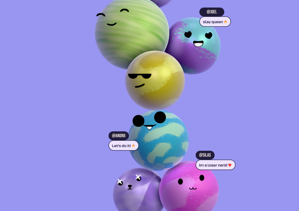
- The Balls, personification of the users
- The Modes, which differentiate between Developer usage and Editor usage.
A duo of typefaces and a range of colors.
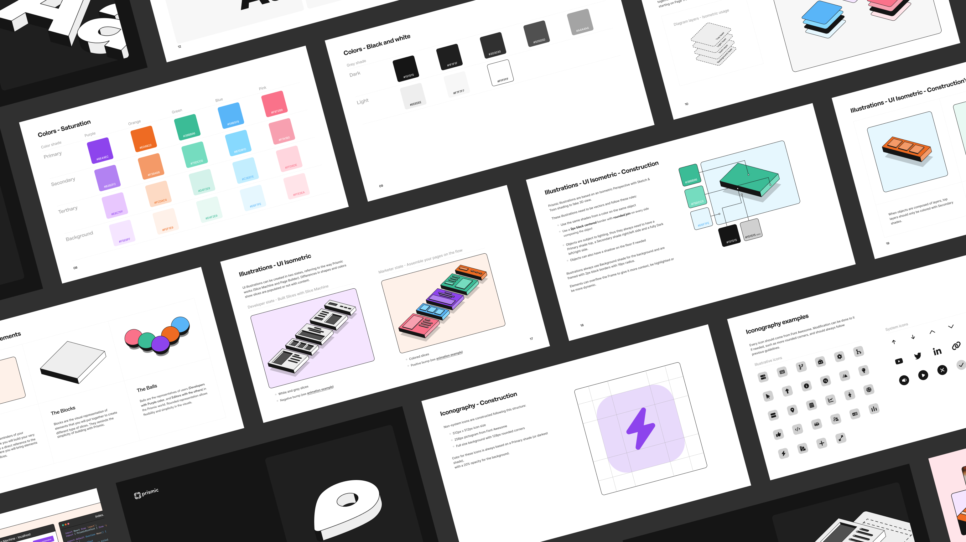
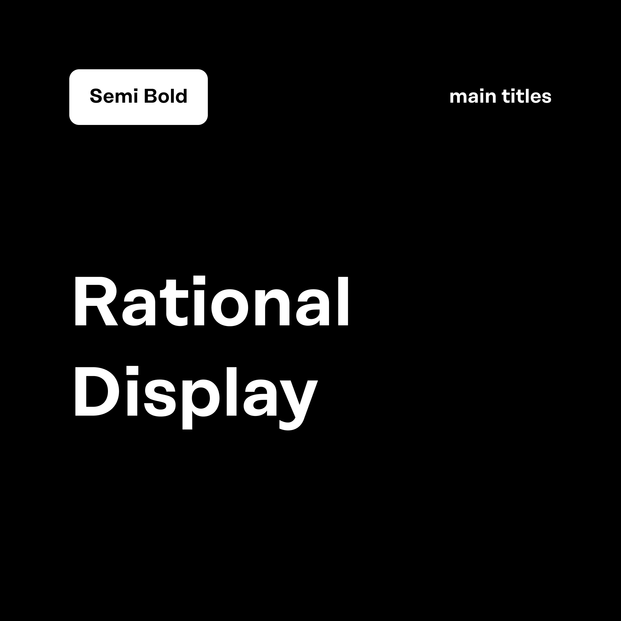
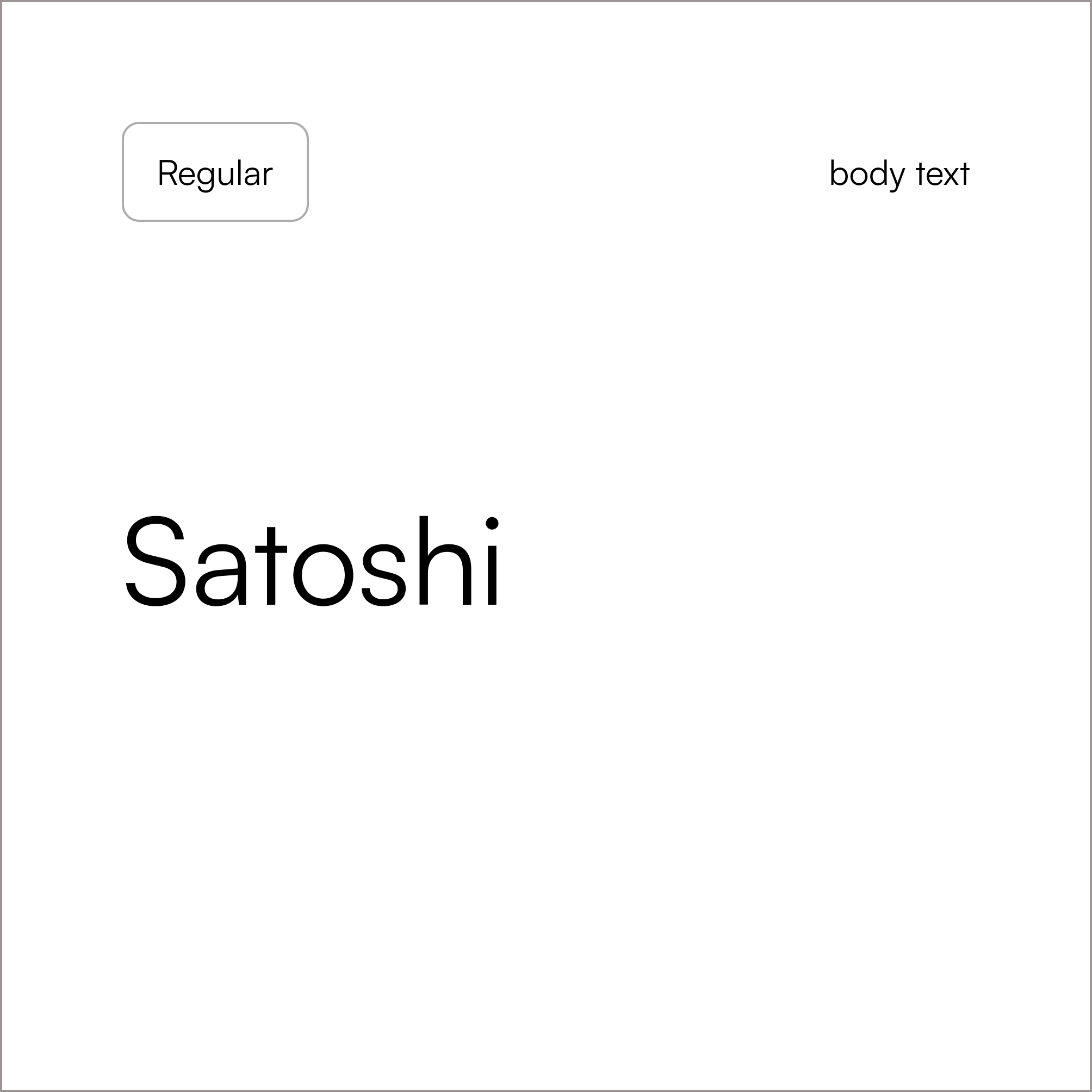
To maintain this contrast continuity (in terms of color, rectangular vs. rounded, etc.), we chose to combine Rational Display and Satoshi.
These two typefaces modernize Prismic's image while also professionalizing it.
The primary colors of Prismic's rebranding are based on the company's history. Purple, orange, and green were already symbolic colors that have been reimagined and modernized, and expanded with bright colors (blue and pink) always in the spirit of dynamism and saturation.
A duo of typefaces and a range of colors.
To maintain this contrast continuity (in terms of color, rectangular vs. rounded, etc.), we chose to combine Rational Display and Satoshi. These two typefaces modernize Prismic's image while also professionalizing it.
The primary colors of Prismic's rebranding are based on the company's history. Purple, orange, and green were already symbolic colors that have been reimagined and modernized, and expanded with bright colors (blue and pink) always in the spirit of dynamism and saturation.
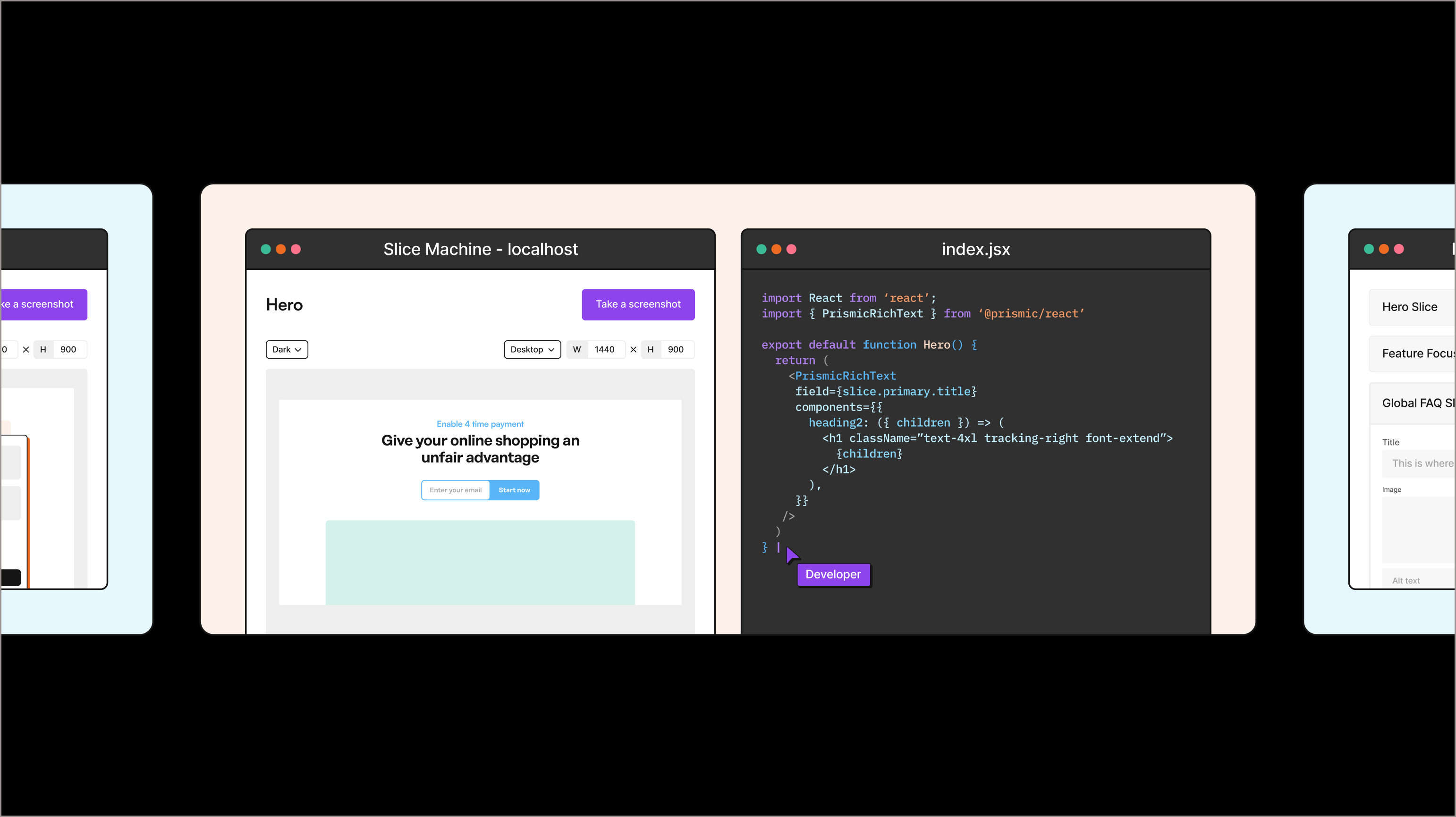
Motion serving storytelling
Prismic illustrations were designed to be dynamic, capturing a sense of movement even in static form. In both cases, they are used to convey a specific idea about the product, its functionality, its benefits, and its distinctions from competitors.